Theming of Collabora Online
How that works and how it looks
Customize it and make it feel at home with your integration. In Collabora Online some parts of the user interface can be hidden or shown. If you are a Collabora partner or a customer running your own installation, you can also change the theming of Collabora Online. And it can be done very easily too; just by setting a couple of CSS variables through your integration. Here’s how that works and how it looks.
User Interface modifications
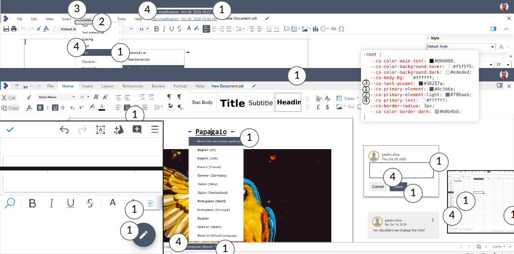
Some parts of the user interface can be hidden or shown based or what the integration needs. This is controlled by:
<input name="ui_defaults" value="VALUES" type="hidden"/>
during sending the form when the iframe is being set up (similarly as the
access_token). The VALUES can have a form like:
UIMode=notebookbar;TextRuler=false;PresentationStatusbar=false;SpreadsheetSidebar=false
With Collabora Online 21.11 use of notebookbar has been deprecated use tabbed:
UIMode=tabbed;TextRuler=false;PresentationStatusbar=false;SpreadsheetSidebar=false
where the:
UIModespecifies the general mode of operator. Possible values arecompact(classicis deprecated) ortabbed(notebookbaris deprecated).Text,PresentationorSpreadsheet- are prefixes to identify the componentRuler,Statusbar,Sidebar- are the UI parts that can be affected by this. These are boolean. For exampleTextRuler=falsewill hide the ruler in Writer.SaveAsModewhen set togroupwill set the layout of the “Save As…” command menu to not be a submenu, but rather list the different format as part of the main menu. Any other value is ignored. By default the different formats are in a submenu from the “Save As…” command.SavedUIStateset tofalseallow forcing the above changes if the user had customised the UI by bypassing the saved state. The use of this option should be limited for case where it’s important to always have this default UI.OnscreenKeyboardHintis tri-state. When set totrue, assume the device has an onscreen keyboard. When set tofalseassume the device does not have an onscreen keyboard. When unset, the automatic detection is done. This should only used for specific embedding situation with specific devices.TouchscreenHintworks likeOnscreenKeyboardHintbut force Collabora Online to think it is running on a touch device. This really should only be used as a last resort as well.
The UIMode can be also updated after Collabora Online iframe is set up
based on a user action through a specific PostMessage call endpoint.
Available variables
Various variables can be overridden for the theming. Their names, and the default values that are used in COOL with the branding package are:
--co-primary-element: #4c566a;
--co-primary-element-light: #706aab;
--co-txt-accent: #2e1a47;
--co-primary-text: #ffffff;
--co-border-radius: 3px;
--co-body-bg: #ffffff;
--co-color-main-text: #000000;
These are only for the branded versions of COOL. If you are using the CODE version of COOL, you can refer to the color palettes CSS file, regular or dark to find which variables you can override.
What it is, and how it looks
Theme it via CSS Variables
primary-elementis for selected elements on menu’s and toolbars, various barsprimary-element-lightis for selected deselected elementstxt-accentprimary-textis the text on these elementsborder-radiusis the rounding of the selection of items on e.g. toolbars and the status barbody-bgis the background beside the documentcolor-main-textis the fall-back in the case a specific element does not have its own color text value.
Tweak it and make it feel at home with your own integration